pacf#
Purpose#
Computes sample partial autocorrelations.
Format#
- rk = pacf(y, k, d)#
- Parameters:
y (Nx1 vector) – data
k (scalar) – maximum number of partial autocorrelations to compute. \(0 < k < N\).
d (scalar) – order of differencing. If only computing the autocorrelations from the original time series, then d equals 0.
- Returns:
rk (Kx1 vector) – sample partial autocorrelations.
Examples#
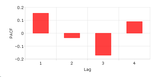
A sample partial autocorrelation function example.#
// Create short time-series column vector
x = { 12.92,
      14.28,
      13.31,
      13.34,
      12.71,
      13.08,
      11.86,
      9.000,
      8.190,
      7.970,
      8.350,
      8.200,
      8.120,
      8.390,
      8.660  };

// Maximum number of lags
k = 4;

// Order of differencing
d = 1;

// Calculate and print result of partial autocorrelation function
rk = pacf(x, k, d);

print rk;
  0.15488076
-0.035928234
 -0.17063786
 0.089875096
Plot the PACF results with plotBar(). Passing in 0 as the first input tells GAUSS to create a sequential series from 1 to the number of elements in rk as the x-tick labels.
plotBar(0, rk);
You can add labels for x-axis and y-axis interactively on the Graphics Page by selecting from the main menu. The plot is shown below:
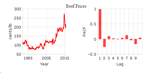
Calculate the partial autocorrelation function (PACF) and plot the results for “beef_prices” data.#
// Clear out variables in GAUSS workspace
new;

// Create file name with full path
file = getGAUSSHome("examples/beef_prices.csv");

// Import dataset starting with row 2 and column 2
beef = csvReadM(file, 2, 2);

// Max lags
k = 10;

// Order of differencing
d = 0;

// Call pacf function
beef_pacf = pacf(beef, k, d);
Create a time series plot and sample partial autocorrelation (PACF) plot based on the beef and beef_pacf variables created above:
// Time series plot
// Declare a plotControl structure
struct plotControl ctl;
ctl = plotGetDefaults("xy");

// Make a 1 by 2 plot with the time series
// plot in the [1,1] location
plotLayout(1, 2, 1);

// Labels and format settings for 'beef' matrix plot
plotSetYLabel(&ctl, "cents/lb");
plotSetXLabel(&ctl, "Year");
plotSetXTicLabel(&ctl, "YYYY");
plotSetXTicInterval(&ctl, 120, 199501);

// Time plot with plotTS function
plotTS(ctl, 1992, 12, beef);

// Making a 1 by 2 plot, the second plot is the PACF plot
plotLayout(1, 2, 2);

// ACF plot
// Fill 'ctl' structure with defaults settings for bar plots
ctl = plotGetDefaults("bar");

// Setting labels and format based on 'beef_acf' matrix
plotSetYLabel(&ctl, "PACF");
plotSetXLabel(&ctl, "Lag");
plotSetXTicInterval(&ctl, 1, 5);

// PACF plot with plotBar function
plotBar(ctl, seqa(1, 1, k), beef_pacf);
You can use ‘Add Text’ to type ‘Beef Prices’ as the title in the graphics window. The plot is:
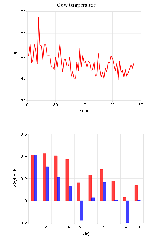
Compare ACF and PACF for “cow” data.#
new;
cls;

file = getGAUSSHome("examples/cows.fmt");

// Import '.fmt' data
load data = ^file;

// Max lags
k = 10;

// Order of differencing
d = 0;

// call pacf function
data_pacf = pacf(data, k, d);

// call acf function
data_acf = acf(data, k, d);
In this example, we compute the ACF and PACF for cow’s temperature and save them in data_acf and data_pacf.
The following code plot autocorrelation (ACF) and sample partial autocorrelation (PACF):
// Compare ACF and PACF for cow's temperature data
// Create sequential numbers
years = seqa(1, 1, rows(data));

// Declare a plotControl structure
struct plotControl cow_ctl;
cow_ctl = plotGetDefaults("xy");

// Set plot title for top graph
plotSetTitle(&cow_ctl, "Cow Temperature");

// Labels and format setting based on 'data_acf' matrix
plotSetYLabel(&cow_ctl, "Temp");
plotSetXLabel(&cow_ctl, "Year");

// Making a 2 by 1 plot, the first plot is the time plot
plotLayout(2, 1, 1);

// Time plot
plotXY(cow_ctl, years, data );

// Change type of plotControl struct
cow_ctl = plotgetdefaults("bar");

// Setting labels and format based on 'data_pacf' matrix
plotSetYLabel(&cow_ctl, "ACF/PACF");
plotSetXLabel(&cow_ctl, "Lag");

// Place the 2nd plot in the second cell of a 2 by 1 grid
plotLayout(2, 1, 2);

// ACF plot
plotBar(cow_ctl, seqa(1, 1, k), data_acf);

// PACF plot
plotAddBar(seqa(1, 1, k), data_pacf);

// Clear 2 by 1 plot layout for next plots
plotClearLayout();
The plot produced by the code above should look like this:
Source#
tsutil.src
See also
Functions acf()