plotSetXTicInterval#
Purpose#
Controls the interval between x-axis tick labels and also allows the user to specify the first tick to be labeled for 2-D graphs.
Format#
- plotSetXTicInterval(&myPlot, ticInterval[, firstLabeled])#
- plotSetXTicInterval(&myPlot, ticInterval[, time_unit, firstLabeled])
- Parameters:
&myPlot (struct pointer) – A
plotControlstructure pointer.ticInterval (scalar) – the distance between x-axis tick labels.
time_unit (string) –
Optional input used for time series plots. The time units to describe the
ticIntervalinput:”milliseconds”
”seconds”
”minutes”
”hours”
”days”
”months”
”quarters”
”years”
firstLabeled (scalar) – Optional input, the value of the first X value on which to place a tick label.
Examples#
XY plot#
// Create the sequence 0.25, 0.5, 0.75...3
x = seqa(0.25, 0.25, 12);
y = sin(x);

// Declare plotControl structure
// and fill with default settings for XY plots
struct plotControl myPlot;
myPlot = plotGetDefaults("xy");

// Place the first X-tick label at 0.5
// and place additional ticks every 0.25 after
plotSetXTicInterval(&myPlot, 0.25, 0.5);

// Draw plot with applied X-tick settings
plotXY(myPlot, x, y);
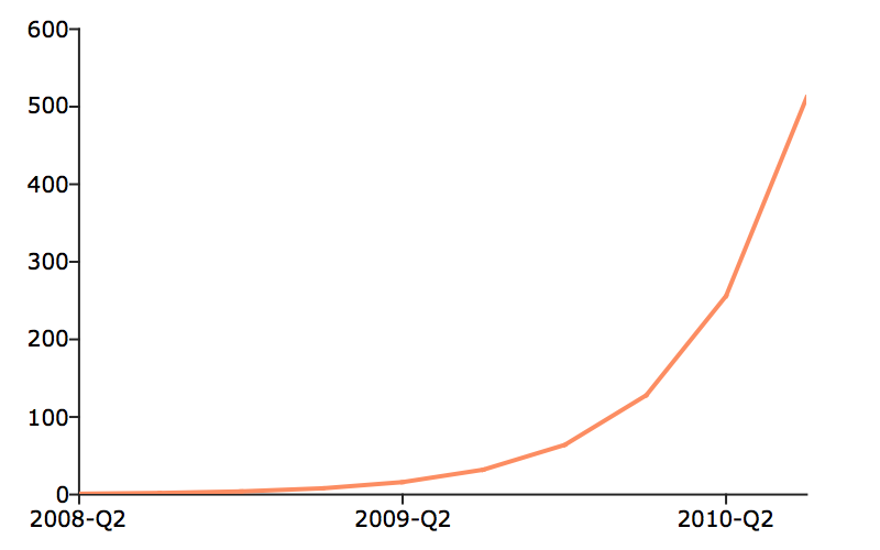
Scalar starting date#
// Declare and initialize plotControl structure
struct plotControl myPlot;
myPlot = plotGetDefaults("xy");

// Place one tick label every 4 x-values
ticInterval = 4;
plotSetXTicInterval(&myPlot, ticInterval);

// Start the time series in April of 2008
dtstart = 200804;

// Specify quarterly data
frequency = 4;

// Create the multiplicative sequence 1, 2, 4, 8...
y = seqm(1, 2, 10);

// Create a time series plot of the data.
plotTS(myPlot, dtstart, frequency, y);
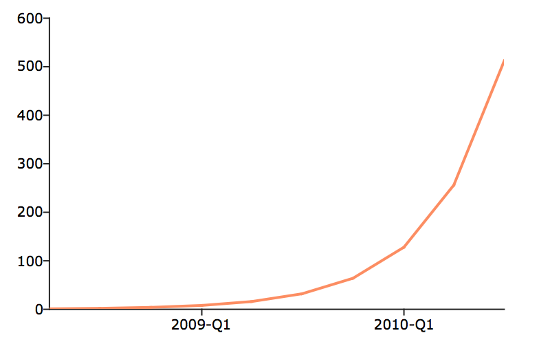
If you would like to change the tick labels so that they start on the first full year, 2009, continuing with the example from above, execute the following lines:
// Set the optional 'firstLabeled' parameter
plotSetXTicInterval(&myPlot, ticInterval, 2009);
plotTS(myPlot, dtstart, frequency, y);
This new plot should now have tick labels only on the first quarters of each year:
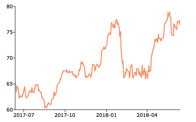
Daily data with full time vector#
// Get file name with full path
fname = getGAUSSHome("examples/xle_daily.xlsx");

// Load all observations from variables,
// 'Date' and 'Adj Close'
data = loadd(fname, "date(Date) + Adj Close");


// Declare 'myPlot' to be a plotControl structure
// and fill with default settings for XY plots
struct plotControl myPlot;
myPlot = plotGetDefaults("xy");

// Draw the first X-tick label at July 2017
// Draw a new X-tick label every 3 months
plotSetXTicInterval(&myPlot, 3, "months", "2017-07");


// Create a time series plot of the data
// using a formula string
plotXY(myPlot, data, "Adj Close ~ Date");
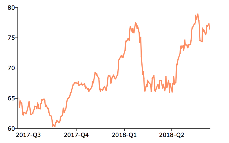
Let’s keep the tick labels on the same locations, however, create 1 tick label every quarter, instead of every 3 months. The following code will accomplish this.
// Draw the first X-tick label at July 2017
// Draw a new X-tick label every 1 'timeUnit',
// which is 'quarters' in this case
plotSetXTicInterval(&myPlot, 1, "quarters", "2017-07");

// Create a time series plot of the data.
plotXY(myPlot, data, "Adj Close ~ Date");
Remarks#
plotSetXTicInterval() is supported for use with XY, Scatter, Contour and
time series plots. It is ignored by other plot types.
Note
This function sets an attribute in a plotControl structure. It does not
affect an existing graph, or a new graph drawn using the default
settings that are accessible from the
menu.
See also
Functions dttostr(), strtodt(), plotSetXLabel(), plotSetXTicLabel(), plotSetTicLabelFont()